When working with Display Templates in SharePoint 2013, you quite often want to provide a similar user experience within your templates to ensure that user adoption is achieved swiftly and simply. One of the key elements to this is to use the out of the box rendering methods where possible. One of the field types that benefits from this, yet lacks documentation is the People Picker which provides a multitude of options for rendering in out of the box lists that can be easily adopted in your own display templates, honouring the expected behaviours of the field.
How do these work out of the box?
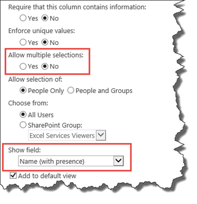
We can see the intended behaviours of the Person or Group field if we look at the settings provided when adding that particular field to a list.
If we look at the two highlighted selections, we can see that there are two particular properties that affect the rendering of the contents of this field, the “Allow Multiple Selections” and the” Show Field” properties. The allow multiple selections obviously controls whether the person or group render field needs to be processed multiple times and the Show Field dropdown controls what is displayed.
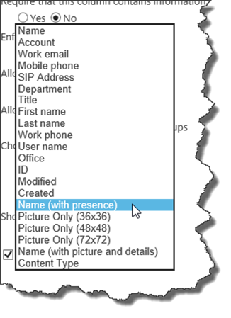
The default, “name with presence” displays the user name along with the presence indicator or ‘Jelly Bean’, other options display either the particular information or image or both. The table below shows what you would expect to see for each:-
It should be noted that the final 5 options, all provide active presence information and if the user is signed into Skype for Business, their current status will be displayed in the area shown as a white bar next to the pictures or in the jelly bean presence icon. Hovering over any of these icons will display the Contact Card for that user.
It should be noted that if you are allowing the selection of groups, then the Picture only options provide no visibility of the group name or membership until you click on the blank person image which does not provide the best user experience.
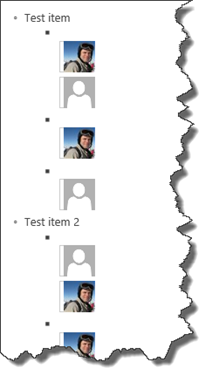
If you select the ability to allow multiple selections, then these will generally stack one above the other in the list view.
How do I do this in a custom display template?
Recreating this behaviour in a custom display template is really simple as SharePoint does all the plumbing for us, all we need to do is provide 4 key pieces of information to one of the SharePoint functions provided by the ClientTemplates.js javascript file.
This particular function is UserFieldRendererRenderField() which takes 4 parameters:-
- Render Context – In the case of a custom display template, this is just the ctx object that we use throughout Jslink development.
- Field – This is the field schema of the field that we want to render, slightly tricky to get to, but not impossible, we create a lookup field in the header of our display template to grab this.
- List Item – The current list item that we’re rendering (ctx.CurrentItem)
- List Schema – Easily provided from ctx.ListSchema
Before we can call this function, we have to warn it first which field we are rendering, and this is done with a call to UserFieldRenderer(), passing in the internal name of the field that we will be rendering next.
Once those 4 items and the field name are provided, the function looks at the current schema of the field and generates the HTML that will provide the results recorded in the table above. You are then able to place this block of HTML wherever you like in your custom display template.
To show this in use, we’ll take the samples shown above, and generate a simple unordered list format for each item.
The whole display template will be available on the SPCSR repository, so I’ll just call out a few key elements here and a couple of the functions.
Firstly, this display template is expecting 3 particular fields:-
| People | Person field with multi select enabled |
| Person | Person field with single select only |
| PeopleOrGroups | Person field with multi select and groups available. |
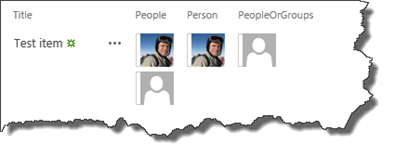
All 3 are configured to display the smallest picture with presence icon only. (As shown in the out of the box rendering above this section)
In our Header function, we create a lookup object to allow us to extract the field schema from the ListSchema by internal name. (It has to be done here as the ListSchema doesn’t exist in the OnPreRender)
//Define our Header Render pattern
pfh.renderHeader = function(ctx) {
	//Define any header content here.
	//You can include JavaScript and CSS links here.

	//We have to do the lookup for our field schema here as it doesn't exist in the preRender
	var lookupHelper = {};
	for (var i = 0, len = ctx.ListSchema.Field.length; i < len; i++)
	{
		lookupHelper[ctx.ListSchema.Field[i].RealFieldName] = ctx.ListSchema.Field[i];
	}

	pfh.peopleField = lookupHelper["People"];
	pfh.personField = lookupHelper["Person"];
	pfh.peopleOrGroupsField = lookupHelper["PeopleOrGroups"];


	var headerHTML = ""
	headerHTML += "<ul class='listWrapper'>"
	return headerHTML;
	}
Once the header is complete and we have our field schemas loaded into our namespace, then we can simply render our custom item for each list item in the view:-
//Define our item Render pattern
//This will be called once for each item being rendered from the list.
//All fields in the view can be access using ctx.CurrentItem.InternalFieldName
//NB: The field must be included in the view for it to be available
pfh.CustomItem = function(ctx) {

    var currentRowID = "listitemWrapper-" + ctx.CurrentItemIdx;
    var itemHTML = "<ul id='" + currentRowID + "'><li>";
    itemHTML += ctx.CurrentItem.Title +  "<ul>";

    UserFieldRenderer("People");
    itemHTML += "<li>" + UserFieldRendererRenderField(ctx,pfh.peopleField,ctx.CurrentItem,ctx.ListSchema) + "</li>";

	UserFieldRenderer("Person");
    itemHTML += "<li>" + UserFieldRendererRenderField(ctx,pfh.personField,ctx.CurrentItem,ctx.ListSchema) + "</li>";

    UserFieldRenderer("PeopleOrGroups");
    itemHTML += "<li>" + UserFieldRendererRenderField(ctx,pfh.peopleOrGroupsField,ctx.CurrentItem,ctx.ListSchema) + "</li>";

	itemHTML += "</ul></li></ul>"
	return itemHTML;
}
Which renders the following output:-
Each of those images or placeholders is an active presence icon where presence exists. I say this because groups do not have any presence and as a result no useful information is displayed, so bear this in mind when using just Pictures with groups.
I hope this has been useful, the full code is available at the SPCSR repository here.
Paul.


